How to Add Google Reviews to Your Website Without Slowing It Down
A strong Google rating can win attention in search, but that reassurance often disappears as soon as a potential customer clicks through to a company’s website. The visitor sees a polished claim, a contact form and perhaps a row of familiar client logos—but none of the detailed experiences that made the business credible on Google.
Bringing reviews onto the website closes that gap. It can also introduce a new one if the site owner installs the first plugin they find, adds a heavy script to every page and never checks what happens when the service is slow or the screen is small.
The useful question is therefore not simply “How do I show Google reviews?” It is: How do I show current, attributable reviews in the right places, while keeping the site fast, readable and easy to maintain?
This guide treats a review widget like any other piece of website software. We will define the job, compare the implementation routes, check permissions and data handling, place the widget intentionally, and test the result under realistic conditions.
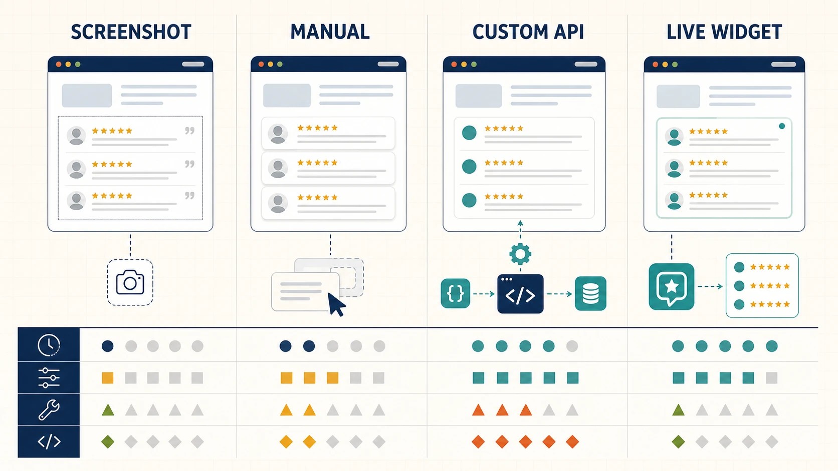
Image 1. Four implementation routes solve different problems. A managed live widget is usually the practical middle ground, but it still needs proper evaluation.
Start with the job the widget must do
“Display reviews” is too vague to guide a software decision. A useful requirement describes the visitor, the moment, and the desired outcome. For example:
- reassure first-time visitors beside a “Book an assessment” button;
- give comparison shoppers specific evidence on a service page;
- show the business’s overall rating in a compact site header;
- provide longer customer stories near pricing or frequently asked questions; or
- give existing customers a clear route to leave an honest review.
These are not the same job. A full carousel in a navigation bar would be distracting, while a tiny rating badge halfway down a high-consideration service page may be too weak. Define one primary purpose for each placement before choosing a layout.
This discipline also limits software bloat. A site rarely needs three review plugins, a social-proof pop-up and manually pasted testimonials all competing for attention. It needs a small number of credible proof points that answer real visitor doubts.
Understand the four common implementation routes
There are four practical ways to move review information from a public profile onto a website. Each involves a different trade-off between freshness, control and maintenance.
1. Static screenshots
A screenshot is quick and visually faithful to the original review. It also becomes stale, is difficult for screen readers to interpret, may be unreadable on mobile and cannot update when the rating or review text changes. Unless the accompanying page provides proper text and attribution, it is a weak long-term solution.
Use a screenshot only when documenting a particular historical moment. Do not use it as the main review system.
2. Manually copied testimonials
Manual cards give a designer complete control and add no external script. They also create an editorial process: someone must check the source, preserve the reviewer’s meaning, add attribution, update the content and remove a review if it is no longer public or appropriate to display.
This route can suit a small brochure site with a handful of carefully selected case-study quotes. It becomes fragile when several people update the site or when freshness matters.
3. A custom API integration
A custom integration offers the greatest control over caching, markup and layout. It also requires development time, credentials, error handling, ongoing maintenance and a clear understanding of the data source’s terms. It is a software project, not a copy-and-paste task.
This option makes sense when reviews are part of a larger product experience or the organisation already has an engineering team and monitoring infrastructure.
4. A managed widget or plugin
A managed service handles much of the retrieval, synchronisation and rendering, while the site owner chooses a layout and pastes an embed or inserts a CMS block. For many small businesses and agencies, this is the sensible middle ground.
The convenience does not remove the need for due diligence. You are still adding third-party software to a customer-facing site. Evaluate it with the same care you would apply to analytics, chat or payment tools.
A nine-point evaluation checklist
Before creating an account or installing a plugin, work through the following checks.
1. Source and attribution
Visitors should be able to understand where the rating and review text came from. Look for clear Google attribution, the business name, reviewer identity as provided by the source, rating, and a route to view the original context where appropriate. Avoid layouts that visually imply the reviews were collected independently by the website if they came from Google.
2. Update method
Find out whether reviews update automatically, on what schedule, and what happens between synchronisations. “Live” is sometimes used loosely. A reliable widget should explain whether it refreshes instantly, daily, weekly or on demand.
Also ask what happens during an outage. Ideally, the last successfully synchronised content remains available or the component fails quietly without covering the page in an error message.
3. Installation footprint
Count what the tool adds: scripts, stylesheets, fonts, network requests, iframes and tracking calls. Google’s web.dev guidance on third-party JavaScript explains why external scripts can affect performance, privacy, security and reliability. It recommends identifying their impact and using asynchronous loading where appropriate.
A clean implementation commonly uses one asynchronous script and a small placeholder element. Be cautious when a simple rating badge requires several libraries or loads site-wide even on pages where no reviews appear.
4. Mobile behaviour
Preview the narrowest common phone width, not just a desktop canvas. Review cards contain unpredictable text lengths, names and dates. Check that:
- cards do not cause horizontal scrolling;
- navigation controls have adequate tap targets;
- long words and URLs wrap safely;
- the component does not jump dramatically as it loads; and
- a carousel can be used without trapping touch or keyboard input.
5. Accessibility
Stars alone are not an accessible rating. A component should expose a text equivalent such as “4.8 out of 5,” preserve sensible reading order and make controls usable by keyboard. Auto-rotation should not force users to chase moving content. Decorative stars should not be announced five separate times by a screen reader.
Accessibility cannot be judged from a screenshot. Test the rendered component with a keyboard and, ideally, a screen reader.
6. Styling control
The widget should look at home without disguising its source. Useful controls include type scale, colour contrast, card spacing, number of columns and light/dark variants. Less useful controls are dozens of effects that make the proof harder to read.
Prioritise legibility and hierarchy over novelty. The rating, review text, reviewer and source should be visually distinct, and the widget should inherit or closely match the site’s typography.
7. Moderation and honesty
Understand whether the service displays all available reviews, a limited source set or a filtered selection. Filters can help a service page surface relevant experiences, but extreme cherry-picking damages credibility. A believable review section may include constructive criticism and a thoughtful owner response.
Google’s own review best-practice guidance says businesses should value honest and balanced feedback. It also prohibits incentives offered in exchange for posting, changing or removing reviews. A website display should support a genuine review programme, not manufacture one.
8. Data and account requirements
Read the privacy policy and installation notes. Does the widget require access to the company’s Google account, or can it work from public business information? What data does the script receive when a visitor loads the page? Does it set cookies, collect analytics or load optional fonts?
The correct answer depends on the organisation’s requirements, but the vendor should make the answer discoverable. Vague documentation is itself a warning sign.
9. Portability and failure handling
Ask how difficult removal will be. A tidy widget leaves behind a shortcode, block or small container that can be removed without breaking the page. Check what a visitor sees if JavaScript is disabled, the vendor is unavailable or the account reaches a plan limit.
A dependency does not need to be perfect. It needs to fail predictably and without blocking the page’s main purpose.
A practical installation pattern
Once a tool passes the evaluation, keep the first implementation small. Create one widget for one page and use a reversible workflow.
- Record a baseline. Save screenshots and run a performance test before making changes. Note page weight, requests and Core Web Vitals indicators.
- Create the least complex useful layout. Start with a compact badge or a short review list rather than the most animated option.
- Install only on a staging page. Do not test a new third-party component for the first time on the live homepage.
- Load the script once. If several widgets use the same library, follow the vendor’s guidance so the script is not duplicated.
- Place the proof beside a decision. Put it near a relevant call to action, service explanation or price—not in a random gap.
- Test responsive and failure states. Use a phone, keyboard and throttled connection. Block the vendor’s domain temporarily to see whether the rest of the page remains usable.
- Publish and measure. Monitor both technical performance and the business action the placement is intended to support.
For a straightforward managed option, a google reviews widget can provide a visual builder and a copy-paste embed without requiring the site owner to create a Google API key. The decision should still be based on the checklist above, not on convenience alone.
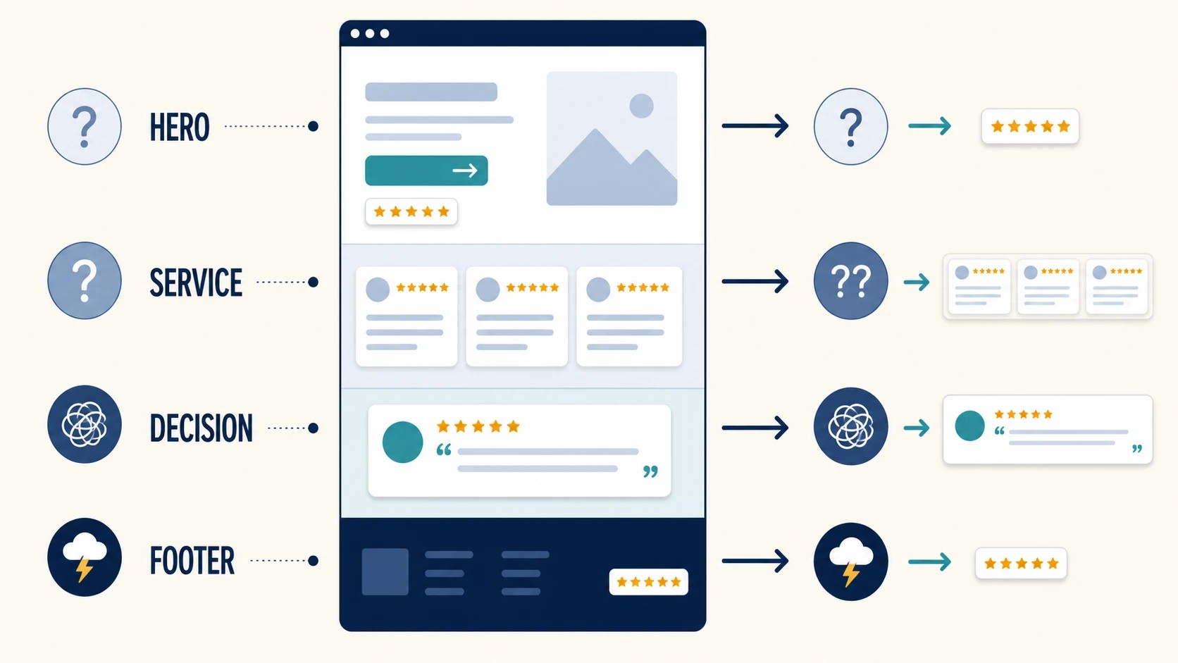
Image 2. Match the amount of proof to the decision: a small rating cue for low-friction actions, and richer review detail for higher-consideration pages.
Put the right amount of proof in the right place
The best-performing placement is not necessarily the one with the most reviews. It is the one that resolves a specific uncertainty without interrupting the task.
Homepage hero: use a compact confidence cue
The hero must communicate what the business does. A concise rating badge can support that message, but a large feed may push the actual proposition below the fold. Show the average rating and review count, then let interested visitors open or scroll to more detail.
Service page: match reviews to the service
Visitors on a specialist service page are asking, “Can this company handle my situation?” Two or three specific reviews are more useful than a wall of generic praise. If filtering is available, use it carefully to surface reviews about that service while keeping the source and selection transparent.
Pricing or enquiry area: answer the final objection
Near a quote form or booking button, a short review about communication, punctuality or value can reduce perceived risk. Do not place an auto-playing carousel directly above fields a visitor is trying to complete.
Footer: keep it small
A site-wide footer badge offers consistent reassurance. Because it may load on every page, this placement deserves extra performance scrutiny. Avoid duplicating a large review feed across the entire site.
Dedicated reviews page: add context, not just volume
A reviews page can combine a broader feed with an explanation of how the business requests, monitors and responds to feedback. Link to the public profile and include a clear route for genuine customers to contribute. Google explains how owners can create an official review link or QR code, and explicitly warns against offering incentives for reviews.
Test the implementation like software
A visual check is necessary, but it is not enough. Run a short acceptance test before and after publication.
Functional checks
- Does the displayed business name match the intended location?
- Do the rating, count and review links make sense?
- Do next/previous controls work with mouse, touch and keyboard?
- Does a “Write a review” link open the correct profile?
- Are dates and long reviews displayed without broken layouts?
Performance checks
Use PageSpeed Insights or browser developer tools on the exact page. Compare results with the baseline and inspect the network waterfall. A single lab score can vary, so look for material changes in transferred bytes, main-thread work and layout movement rather than obsessing over one point.
Test a mid-range mobile profile and a slower connection. A component that feels instant on office Wi-Fi and a current laptop may feel very different to a customer outdoors on an older phone.
Resilience checks
Temporarily block the widget’s domain or test offline after the main page has loaded. The heading, offer, navigation and form should remain available. If the widget reserves no space and causes the page to jump when it appears, set a sensible minimum height or choose a more stable layout.
Content checks
Read every visible state. Confirm that truncation does not change a reviewer’s meaning and that owner responses do not expose private information. Check the component again after theme, consent-manager, or caching updates.
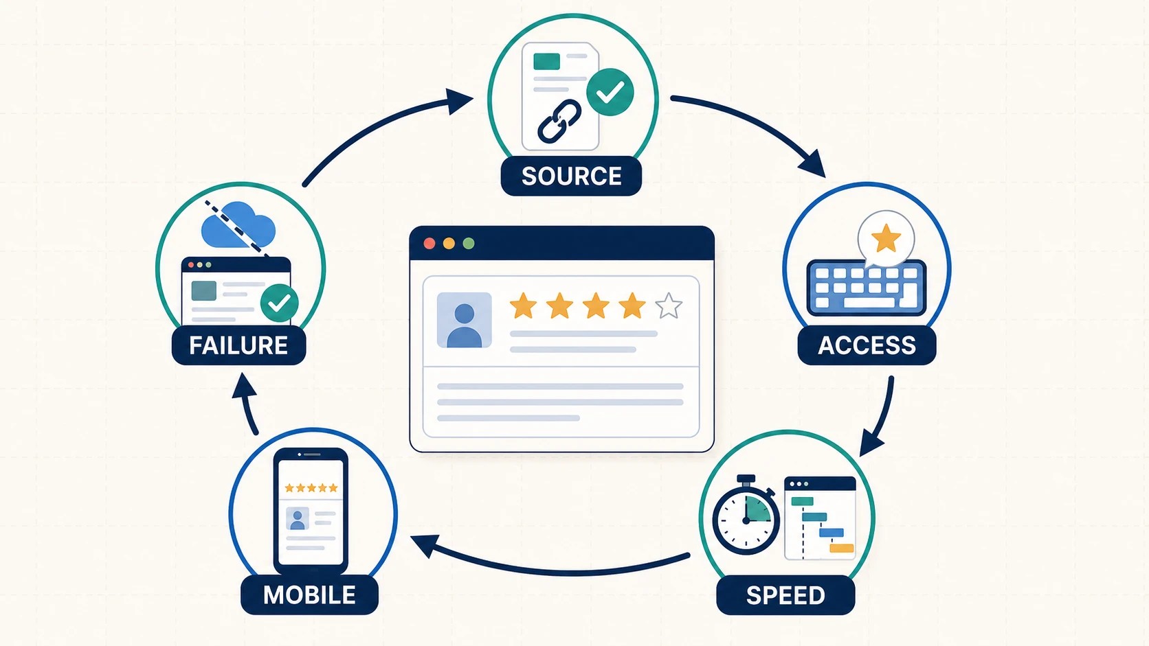
Image 3. Review widgets should enter the same release loop as any other website feature: verify, measure, test edge cases, publish, and monitor.
Avoid three common misconceptions
“A review widget automatically improves rankings”
The business case for displaying reviews is primarily visitor trust and decision support. Do not promise a ranking increase or guaranteed star-rich search result. Google’s review snippet documentation says rich-result appearance is not guaranteed and specifically restricts self-serving review markup for LocalBusiness and Organization types, including when reviews arrive through a third-party widget.
Structured data can help machines understand eligible content, but it is not a switch that forces stars into search results.
“More reviews on the page is always better”
Volume can demonstrate consistency, yet it can also make a page repetitive and slow. BrightLocal’s Local Consumer Review Survey 2026 indicates that people consider consistency, recency, rating and response behaviour—not merely a pile of positive quotes. A focused selection with access to the broader source is often more useful than dozens of cards.
“Install once means finished forever”
Every external integration needs an owner. Schedule a quarterly check for broken layouts, outdated settings, accessibility regressions, policy changes and plan limits. Re-test after a major CMS or theme update. Keep the account email and billing owner documented so the component does not silently fail when a staff member leaves.
A simple maintenance routine
The ongoing workload can fit into a short checklist:
- Weekly: respond to new reviews on the source profile; do not use the website widget as a substitute for engagement.
- Monthly: check that the rating, links and newest content are synchronising as expected.
- Quarterly: test mobile, keyboard access, performance and failure behaviour.
- After major site changes: verify script loading, consent settings, caching and visual styles.
- Annually: review the vendor’s terms, privacy information, costs and export or removal options.
Keep review collection separate from review display. The first is an operational habit involving real customers; the second is a publishing tool. Google’s guidance favours timely, personal responses and prohibits manufactured engagement. Software should make credible feedback easier to see, not distort it.
Final recommendation
A review widget is a small component with an unusually large trust role. Choose it as software, not as decoration.
Begin with one clearly defined placement. Verify the source and update method. Inspect the third-party footprint. Test accessibility, mobile behaviour and failure states. Measure the page before and after. Then maintain the integration alongside the rest of the site.
Done well, the result is quiet but valuable: visitors can see current customer evidence at the moment they need reassurance, while the website remains fast, usable and honest.